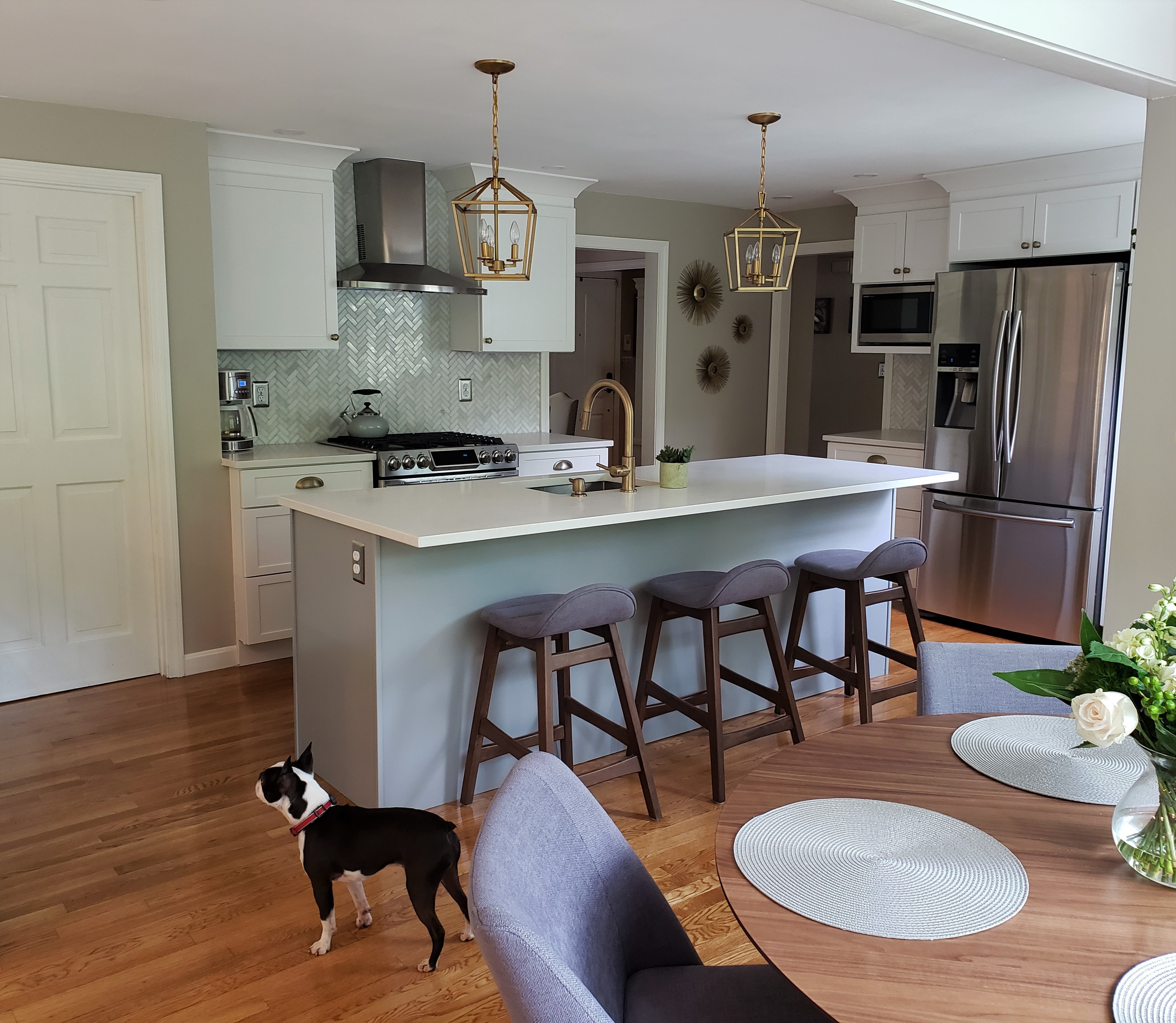
The two-toned kitchen trend has been picking up steam in recent years, and we’re glad about that because 2 colors can be so versatile, ranging from fresh and airy to bold and dramatic. It’s especially adaptable when a homeowner wants the lightness and brightness of a white kitchen without creating a completely whitewashed space. We were excited to work on this two-tone design & renovation, based on white as the main color and a Juniper Berry painted island (a blue grey).
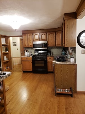
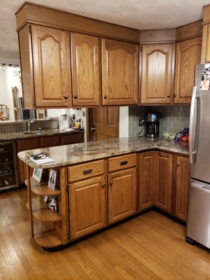
This concept turned out to be the perfect solution for a couple who wanted to renovate their 25 year old kitchen. The dark oak cabinets with arched uppers dated the kitchen, and the center stiles ruined the function. Overall, the whole space felt heavy and tired.
From a functional standpoint, the layout of the countertops and appliances was less than ideal. The sink and the stove were too close together, leaving very little countertop space to work on in between. A peninsula countertop with hanging wall cabinets made the overall layout awkward to navigate. Plus, the decorative open shelving at the end of the peninsula was wasted space since anything placed there became a temptation for the family’s playful dog.
The homeowners wanted to redesign the floorplan so it would be spacious and easier to use, and the overall layout felt more open. Removing the peninsula and adding an island opened up the floor plan and made for a better flow from the sink to range, and from the kitchen to the breakfast area.
In addition to creating a strategic location for the sink with more workable countertop space, the island also added barstool seating. The new layout also allotted for plenty of storage space. After unpacking, there was a full drawer and pantry rollout that were empty!
The existing kitchen also had two sinks, but this family only used one. They wanted a main single sink in the newly designed kitchen. By removing the bar sink, they gained extra countertop space for a charging station, their daughter’s school projects or setting up buffets at holidays. They reused their existing beverage fridge, making this a perfect area when entertaining.
Aesthetically, they wanted to ditch the dark and drab and create a lighter space that would be updated and inviting.

They chose white for the main kitchen space, which can safely work with any color in a two-toned kitchen. The island also created a focal point for the new layout, which was a perfect place to make a statement with a second color. The homeowners chose a lovely blue-grey shade called Juniper Berry, which imparts a cheerful yet sophisticated tone.
A complementary shade was painted on the walls of the kitchen and the adjacent dining space, which, along with the consistent wood flooring, created an open flow throughout the space. A pale green tile backsplash behind the range and rich greyish blue seating tied the two-tone look together beautifully.
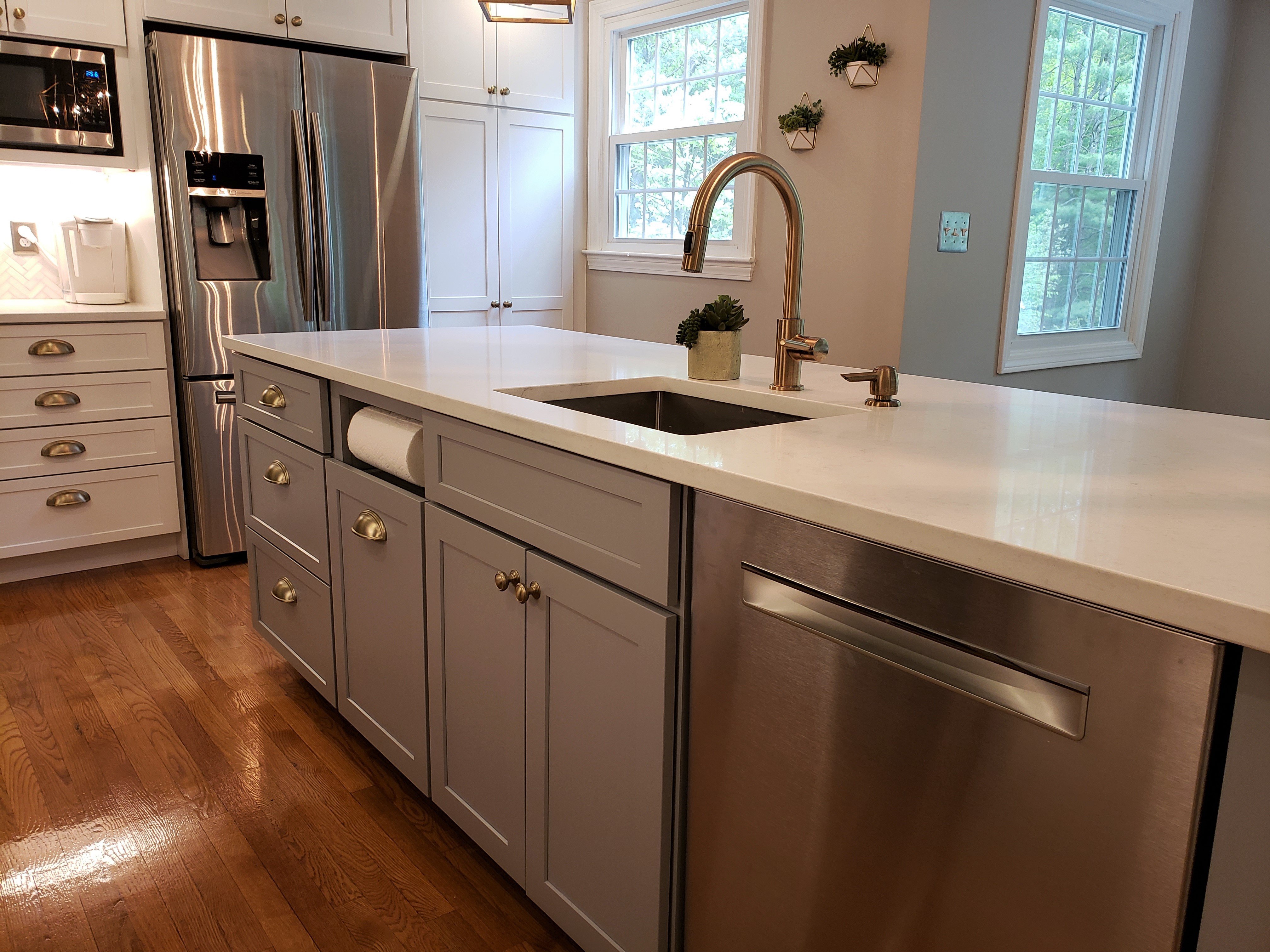
Small touches, such as a paper-towel holder built into the island cabinetry, make regularly used items accessible while keeping the countertops clear and uncluttered. The family of three are thrilled with their new kitchen, which should serve them well for years to come.
Are you curious about whether a two-tone kitchen would work for you? If you’re considering renovating your kitchen, we’d be happy to talk with you. Edesia is a Best Of Houzz award winner for client satisfaction in 2017, 2018, and 2019. Take advantage of our free consultation and estimate by contacting us online or calling 781.238.8800.

