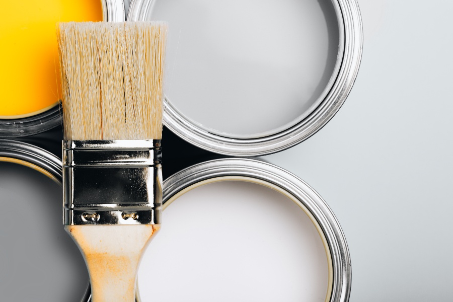
This past December, we designers anxiously awaited the color of the year from the paint manufacturers. Every year these companies “predict” the upcoming color that all products will be arriving on the store shelves. These are based on current trends, fashion from Europe and Hollywood productions. Somehow, they all, independently, decided on the same color – green.
These are their colors, by manufacturer:
 Ben Moore: October Mist 1495

Sherwin Williams: Evergreen Fog SW9130
 Pratt & Lambert: Gray Mist 419B

Behr: Breezeway
Colors Have Meaning
All colors have meaning; the color green represents nature. Being “safe at home” has helped lots of people step out of their home offices and go for a walk, seeing the beauty that nature has to offer. It's always been there, just many are starting to see it. The parks are once again filled with kids, trails in the woods filled with families and their newly adopted dogs. For this, I am grateful!
Green also represents tranquility, good luck, health and money. In the Bible, green represents bountifulness, hope and victory & breaking of the shackles. interestingly enough. I personally have never been a fan of green. These colors remind me of pea soup, and who likes that?
In comes Pantone’s Color institute’s color of the year to the rescue. The Pantone Color Institute™ is a consulting service that forecasts global color trends and advises companies on color in brand identity and product development. Their decision dictates the color of all your future purchases, whether it's home goods, an automobile or clothing. They are at the top of the decision-making food chain when it comes to color.
Last Year's Colors
Last year’s colors were Ultimate Grey & Illuminating, a bright yellow and a mid-tone grey. Yellow was to represent vitality, like the sun; the grey was to represent the solid things in our lives, such as stone. To me, the grey was reflective of the mood of the people, worried they will never escape a virus, destined to be sick forever. I recall using it on Bank of Boston projects, right after the economic crash of 1991, some time ago. Well, we aren’t grey anymore.
Many are learning how to live their lives again, but differently this time. Working at home saves time and commuting stress, which is now spent with family, friends and improving health. Perhaps moving forward, we will live in a more intentional and compassionate way?
Color of the Year
Recently, Pantone released their color of the year – Veri Peri. I am particularly fond of the color. A shade of purple is with my company logo, as well as my recently painted Victorian home!
Coming home to a purple home makes me smile!
Purple - The Color of Majesty
Purple has a lot of meaning and connotations to it. It represents wealth, royalty, creativity; it’s a statement of independence. It also represents the Crown chakra, located at the top of the head. It represents pure thought, connecting one to consciousness. Not a bad goal for us all.
House Beautiful wrote a great article on how to use this color: https://www.housebeautiful.com/uk/decorate/looks/a38599711/purple-very-peri-colour-combinations/?fbclid=IwAR2jcnxfT0xA87OSQ5imYb8ugec3S2yjeu7dula9cMpV7K4Y4NjTpi_I7yo

